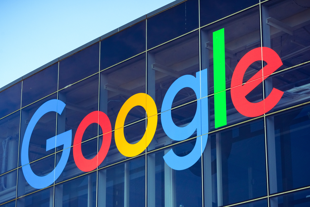
Headed by Sundar Pichai, Google now has its new logo. Just a few weeks back, the company announced a huge restructuring effort. And, now it is reveals its new identity, which is evidently more crisp and clear. Have a look:

Retiring its iconic ‘Catull’ font, the new sans-serif logo is in the news for many reasons. Although, the color scheme is kept the same with blue, yellow, red and green, yet the new design is still the latest one after the changes done in 1999. Being the biggest change after 17 years, the design is flatter than the old logos and more capricious.
In earlier days, Google was just a destination accessible from your desktop PCs. But, now it is being used across different platforms, apps and devices, all at the same time. Introducing the new logo and identity, ‘Google’ wish to spread its magic on all screen sizes, ranging from the old desktop to the tiniest screens of your phones/watches!
In addition to this, Google has also switched up the previous small case “g” to the uppercase “G”, which will now be visible in all four of its trademark colors striped on the browser tabs.
![]()
As far as the reactions are concerned, it is coming in different directions from all over the world. Leave your comments and let’s know how these changes make you feel different now. Go Google!

Started working as a digital marketing expert, Varun Sharma is now also a well-known digital marketing speaker – a speaker on performance development, and a trusted mentor to businesses in the digital world. His keynote expositions are based on the digital marketing theories, which provide a fascinating insight into the secrets of high performance.

