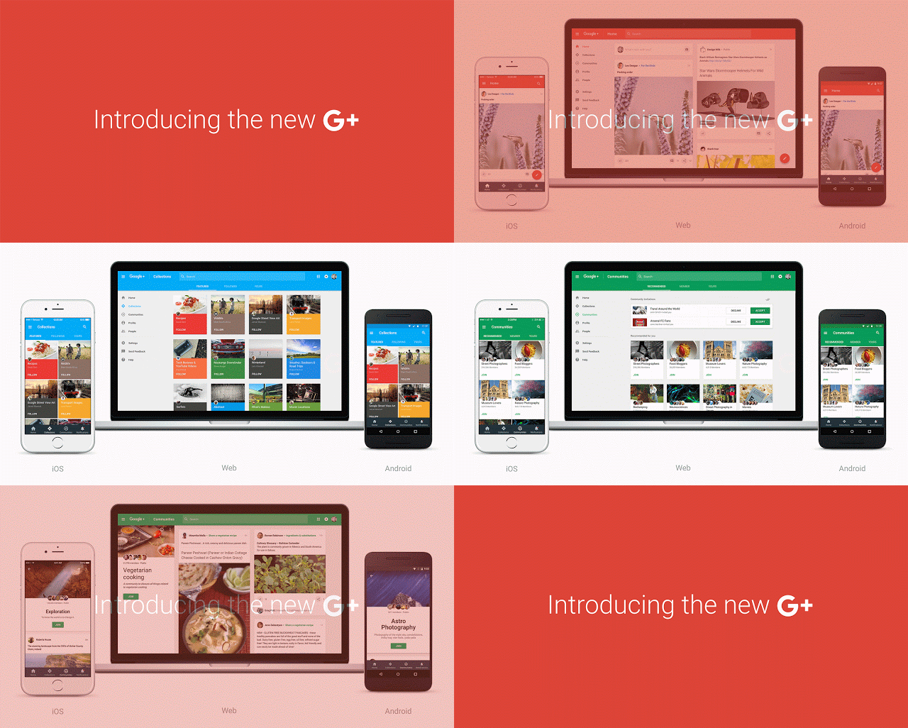
Did you hear about the new Google plus that rolled out a few days back? No!!
Continue to read and know about it!

Google has been creating and updating services for the sake of its users and to give them a better experience. And this month, it has come up with changes in its social media site, GOOGLE+
Google Plus has released their first, mobile responsive design. With this, it clear indicates their focus on collections, communities, content and curation.
Google has introduced a completely redesigned Google+ that puts Communities and Collections front and center. The new Google+ is much simpler with more focus on interests. Plus, it’s more mobile-friendly. It has been fully rebuilt across web, iOS and Android to facilitate users with a fast and consistent experience irrespective of their screen size.
Users will need to opt-in to this new version of Google+ on the web to see the modifications.
With the new Google+, Google said that it’s all because of its users. “Your feedback got us this far—as we continue to refine Google+, we’d love to keep hearing from you. In the meantime, we look forward to seeing how today’s changes help kick start even more conversations around.”
Share your views with us about the new Google+!!!!
Related Link: https://googleblog.blogspot.in/2015/11/introducing-new-google.html

An enthusiastic Human Being with a zeal to express as much she can in words… and Blogs gave her a medium to express and share her knowledge. Has written for eminent blogs and fields like the social media, internet marketing, technology, lifestyle (tattoos, body art, fashion, etc.), politics, and the list is still increasing.

