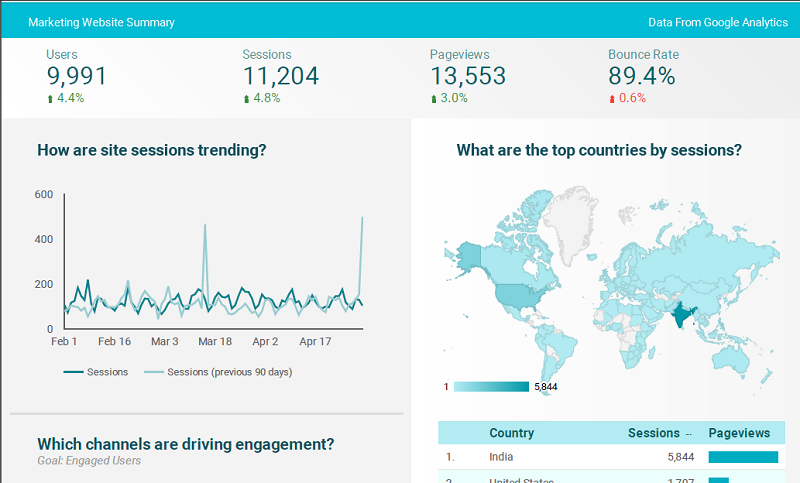
If you are into digital marketing, probably you might have faced different challenges with analytics. While it typically involves downloading Google Analytics data, followed by adding the same to Excel spreadsheets for making charts and diagrams, these can be still very confusing and overwhelming for an ordinary human to understand.

Have you been providing your clients with analytics reports for how their site or campaigns are performing? But they often fail to understand your hard work? The only reason is that the information you submit is overloaded with data and difficult to understand. Your solution is with Google Data Studio. Yes, now Google allows you to create reports which are easy to understand for every business.
Google Data Studio- What is it?
So far you might be practicing various Google products including Google Ad words, Google Analytics, YouTube Analytics and Google Sheets. Being a data visualization product, Google Data Studio is unique and it comes with a very clean and easy to grasp user interface. With this even a newbie would be able to prepare reports in a professional manner. While you will be able to connect to existing Google data directly, it allows you to analyze whilst sharing it with other team members.
This means, now you can turn those lengthy and tedious reporting tasks into a quick and easy one. Moreover, it facilitates you for creating customized and interactive reports for your clients. In case, you still are not sure for its usage, here are some compelling reasons to make a switch.
Why to Use Google Data Studio?
Below are listed some simple reasons why your business needs to start using Google Data Studio.
1. Free and unlimited:
The best thing about Google Data Studio is that all its robust reporting features are exclusively available at no additional cost. Though earlier it was free to create just 5 reports, but now you can easily create and share as many reports as required. There might be several paid alternatives promising better features, however, Data Studio is constantly getting feature updates.
2. Customization is available:
Want to start out with a blank template? Or you need to use a pre-programmed template? Data Studio comes with the flexibility to create totally customizable dashboards. So whatever you choose, just drag and drop charts, widgets, and data to prepare your unique report. If you want to add more personalization to it, there is option for adding different colors, fonts, and formats.
3. Real-time and Interactive Reporting:
With Data Studio fetching real-time data from different sources including Google Ads, YouTube, and Google Analytics, it let you create real-time, dynamic and interactive dashboards.Along this, you can use “connectors” to extract information from third-party websites such as Bing and MailChimp. So with these you gain valuable insights from cross-channel marketing campaigns and prepare a report integrating data from numerous sources. Later, if required, you can modify the date range and add filters to get the real-time (or past) data.
4. Data Blending:
When it comes to the most heavily requested features, it is none other than Data blending. Without any doubt, it has enhanced the power of this product. As the name states, this feature adds in the ability to ‘blend’ multiple data sources into a single chart or graph. Now if you have multiple Google Analytics views for a website, say the Desktop and Mobile Only views, this Data Studio feature allows you to see that data combined into one singular graph. Simply stating, you can utilize both data sets instead of having separate visuals in the same report.
5. Collaboration at Its Finest:
Why are you preparing these unique reports? Of course, you want to share and collaborate with others. It is here when Data Studio seems to be serving best. With it you can easily share your reports with anyone and let them view, comment, or edit your data. And if you want to assign user specific permissions, this useful feature also exist. It is your choice; give them “view-only” access so that they cannot change anything without your permission. Plus, you have full access to work on the same report at the same time.
Now when you are clear with the idea that Google Data Studio can be a total game changer, you must be looking forward for how you can use it. Keep reading!
Steps to Use Google Data Studio- Beginners Guide
1. Login:
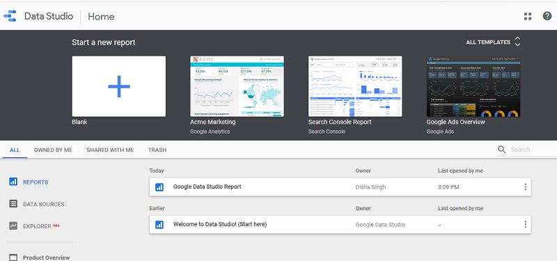
A robust free version of Google Data Studio is available for you. The interface appears similar to that of Google Drive’s interface. Remember, this portal will only store your Data Studio documents, which are further divided into two categories: reports and data sources. You can login the same at datastudio.google.com using the same account details that you have been using for Google Analytics.

2. Prepare Your Report:
Go to the reports section and click the “+” button at the top left or bottom right. You reach a blank page.

Running short on time? Want to create a quick data report from Google Sheets, Google Analytics, Search Console, YouTube Analytics, Google Ads, or Google BigQuery? Simply switch to the ready to use Data Studio’s report templates.

3. Connect Your Data:
Click the “Create New Data Source” to connect data to your report. It simply lets you connect your report to 98 partner data sources and 18 Google data sources. After selecting a data source, let Data Studio connect to your Google Analytics account. Later you can select your account, property, and view. From the spreadsheet of fields or metrics which pops up next, press the “Add To Report” button to connect the data to your report.

4. Customize as per Your Need:
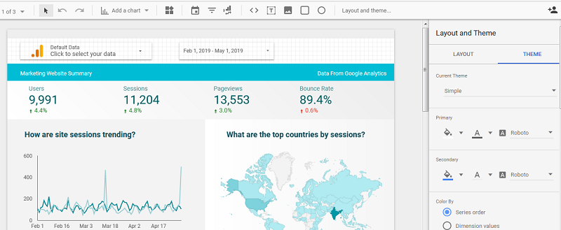
As stated above, this product comes with customization option. Initially, it will be a blank grid to which you can easily add different types of visualizations. In fact, you can customize the layout and theme before adding your visualizations. Need to add another data source? Click the “Resource” button and press “Manage added data sources”.

5. Adding visualization:
From creating a time series, pie chart, table, geo map, bar chart, combo chart, scorecard, bullet chart, area chart, scatter chart, to a pivot table, there are endless ways to visualize data in Data Studio. Besides, you can add images, text, and shapes, as per your requirement. Select the visualization, drag it to your preferred size, and just release. It will appear immediately after.
Also you can edit your visualization. The right sidebar of your report has the option to edit your data source, metric, dimension, and date range.
Your report is ready!

Started working as a digital marketing expert, Varun Sharma is now also a well-known digital marketing speaker – a speaker on performance development, and a trusted mentor to businesses in the digital world. His keynote expositions are based on the digital marketing theories, which provide a fascinating insight into the secrets of high performance.

