Do you feel frustrated when you’re shopping online, and you can’t seem to find the “Buy” button or navigate to your shopping cart?
Or sometimes the menu is too complicated to navigate?
You’re not alone.
We all have been there.
And it’s all due to poor website structure or website architecture. Websites are meant to be user-friendly and easy to navigate, but when their structure is flawed, it can lead a user to confusion and frustration.
If you run a website, you don’t want such things to happen to your visitors.
Let’s get into the website owner’s shoes and check out your website to see if you have such errors in your website structure that could turn off the visitors.
But first of all, let’s go through this simple definition of website architecture so that you can understand things more clearly.
What is a Website Structure or Architecture?
Website architecture is like the organized layout of your website pages. It’s kind of like a map that helps people easily navigate your site and also helps search engines understand how everything is connected.
Having a good website structure is super important because it keeps people on your site and helps them find what they’re looking for. Imagine you have awesome stuff on your website, but if it’s all jumbled up and hard to find, people might leave and go to another website instead.

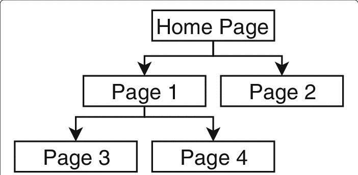
Picture your website structure as a tree with a main page at the top (that’s the “root”). Then, there are pages linked to it (those are like branches), and from those branches, more pages can sprout out (those are like smaller branches). All these branches connect, forming a sort of tree-like structure.
So, having a well-organized website is like having a well-arranged tree, and it makes sure visitors can easily explore your website without getting lost.
Top Mistakes to Avoid With Your Website Architecture
Making a Complicated Menu:
When setting up your website, keep your top-level navigation menu straightforward. Here’s why it matters:
- Limit Menu Items: Don’t overload your menu with too many options. It’s easier for users to choose where to go if there are fewer choices.
- Match Menu Names to Content: Make sure that when users click on a menu item, they find what they expect. For example, if you have an “Email Marketing” tab on your blog’s homepage, it should lead to a page with email marketing posts. And from there, make it easy for them to get back to your blog’s homepage or your main website.
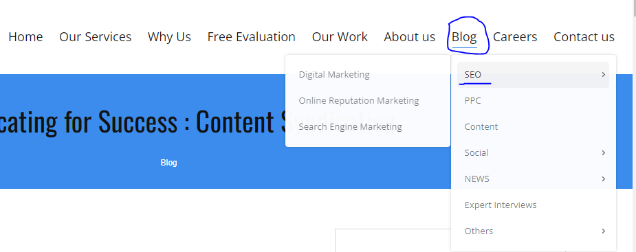
Here’s an example from our website:
Our blog is divided into different sections, and some of these have sub-sections. But we’ve organized it in a way that’s easy to follow.

So if you notice one category growing disproportionately, consider dividing it into smaller, more manageable categories. Regularly monitor the size of your categories, especially if you frequently publish content.
Remember, the goal is to make things simple for your users. If your website is confusing and hard to navigate, people will quickly leave. Nobody wants to waste time searching for information. So, think about your users and create a website that’s easy and enjoyable to use.
Making Complicated Website Addresses
Imagine you’re looking for something on a website, and the web address (URL) looks like a secret code: example.com/store/rackets/default.aspx?lang=en&category=98a20.
That’s no fun, right?
Well, one common mistake in website design is creating these super complex URLs.
Instead, you want your web addresses to be user-friendly. Luckily, many website platforms like CMS Hub and WordPress do this automatically. They’ll make your URL look something like this: example.com/page-title. Nice and simple, just like it should be.
You can even organize your website into neat folders, like this: example.com/topic/subtopic/page-title. It helps users understand where they are on your site.
Here’s a cool tip:
While these folders make things easier for users, they’re not necessary for your website’s structure.
What’s more important is how you connect everything inside your site. So, you can have URLs like example.com/topic or example.com/subtopic. Just make sure you link them together so people can smoothly move around your website.
It’s like building a web of connections.
Hiding Your Cornerstone Content
Cornerstone content is the most important, valuable, and informative part of your website. It’s what attracts visitors and establishes your expertise in your field. However, some website owners forget to link to their cornerstone content, making it difficult for users and search engines to find and recognize it.
Ensure that your cornerstone content is easily accessible from your main menu. Additionally, when you create related content, link back to your cornerstone articles. This helps users understand the connections between your content and boosts your SEO ranking.
Creating Too Many Tags
Tags are handy for organizing and grouping related content, but overusing them can lead to a lack of structure. If each post has numerous unique tags, your website won’t benefit from the organizational power of tags.
Use tags sparingly and make sure they apply to multiple posts. Visitors should easily find tags at the top or bottom of your posts. This helps them explore more content on the same topic and aids in SEO.
Failing to Use Breadcrumbs
Breadcrumbs are like a trail of breadcrumbs in the forest, guiding visitors through your website and helping them understand where a page fits into the bigger picture. They enhance both user experience and SEO by showing the structure of your site.
Implement breadcrumbs on your website, especially if you use WordPress. There are breadcrumb plugins available that make this process simple and effective.
Forgetting to Visualize Your Website Structure
Many website owners neglect to plan their website structure, resulting in a disorganized and confusing user experience. Visitors should easily access important content from the homepage, but an overcrowded menu can overwhelm users.
You need to prioritize user experience when designing your menu. Include the most important pages and avoid overloading them with unnecessary options. Think about what your visitors are searching for and how you can assist them in navigating your site.
Not Linking “Child Pages” to Their Parent Pages (I mean Your Underlying Pages)
You might have many blogs on your website.
Go through those blogs to see if they are linked to other articles present on your site.
As you can see in the image given below, here is the paragraph about content marketing. Check out how the keyword “creating content” is linked to the content guide. See the connections?

Here comes the pillar-cluster model you need to follow.
Here’s how it works:
Pillar: Think of this as the main article. It’s the one that links to other articles.
Cluster: These are the other articles that relate to the main one. They link back to each other too, like a little community.
Now, why is this cool? It helps people find what they’re looking for easily. When someone clicks a link on your website, they should know where it’s taking them and why it’s there.
But wait, there’s a catch! You shouldn’t stuff keywords into your links. That’s like trying to trick Google, and they don’t like that. They even have special rules to penalize it. So, keep your links natural and helpful, not spammy.
Wrapping Up…
Your website structure is the backbone of a successful online presence. Avoiding these common mistakes can lead to better user experiences, improved SEO, and ultimately, more success for your website and business. By paying attention to your website’s structure, you can make it easier for users to find what they’re looking for and ensure that your online presence is seen and appreciated.

Started working as a digital marketing expert, Varun Sharma is now also a well-known digital marketing speaker – a speaker on performance development, and a trusted mentor to businesses in the digital world. His keynote expositions are based on the digital marketing theories, which provide a fascinating insight into the secrets of high performance.

