Is your Facebook Cover Photo having the right size & dimensions?

Facebook has turned to be the most popular networking sites with 900,000,000 estimated monthly visitors. Whether your personal or business profile–no more profiles are reconfigured in a fixed layout and appearance. They are much more; a manner in which a viewer get to know more about you or your business.
“Images speak better than a word…”
Undoubtedly, it is true and it becomes more significant in the world of internet marketing. And in the recent years, one of the most noticeable changes which happened to Facebook is its focus on the visuals, especially the ‘cover image’. It is one of the biggest visual changes included in the Facebook timeline. While a visitor lands on your page, they don’t only see the small square profile image but come across a large photo which appears at the top of your page.
Calling this cover photo a ‘large panoramic’ image space at the top of the timeline, will not be wrong. So, let’s first have a glance at the appropriate dimensions;
Your cover photo is displayed at 851px wide by 315px high, like this:


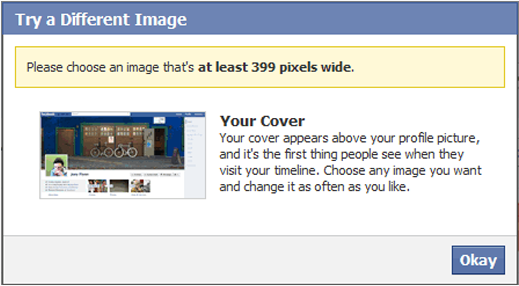
Secondly, remember that the cover image you are uploading need to be at least 399px wide, else you will get something like this:
You have two options; either upload a photo already cropped and resized precisely to those sizes or if you upload a larger image, you need to ‘move’ the image, to select the crop you’d like to be displayed.


At a time you can designate only one photo as your Cover image but you can also opt for assembling a collage.


In all, the cover images need to be used intelligently in order to attract the followers, fans, and audience.
As per the latest Facebook guidelines the cover photo shouldn’t include pictures with more than 20% text. But, you can include “calls to actions” or some offers like, “20% off”. In the similar way you can requests for “Like” or “Share” for your fan page too. Now, when you are well-aware of the technical specifications, it’s right to spot over some of the great examples and advice for astounding covers;
Examples of 4 most Creative Facebook Page Cover Photos in 2014

1. Start your hunt with some sharp and crisp image while you are choosing a cover photo. The reason being, the picture is going to be big enough and the details will appear to your visitors. The best example comes from the cover image of Facebook founder Mark Zuckerberg. Right now he is using a map, which depicts the friendships formed on Facebook across the world.

2. Go different every time! Though you will find a number of ways to grab a timeline cover image yet, they will not be efficient in depicting what you do. At times, when you are not ready with a giant photo of yourself, select something unique and showcase some of your brilliant work. Have a look at profile of copywriter Giuseppe Draicchio.

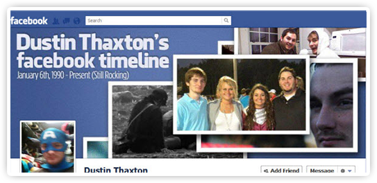
3. Stick to the rules! Choose a cover photo which use the space well and remember the placement. Something with ‘heart’ of the picture at top or right of the photo, which ensure that the square cutout (profile picture) does not cover your image, example: Dustin Thaxton.


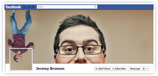
4. Next comes, a popular style to merge the Facebook cover photo and profile photo together. And if you wish to add a surreal and humorous integration to this combo, things can do magic. Check some of the best examples of Jeremy Bronson, Ekkapong Techawongthaworn, Erni Pedernera and many others.
- Just avoid images that are pixelated!
- Also stay away from the offensive images or those,which might showcase you or your work in a negative light.
- Make sure that the image you select represents a digital part of yours.
- Moving with the technical specifications, spark up a little imagination for best outcomes!

An enthusiastic Human Being with a zeal to express as much she can in words… and Blogs gave her a medium to express and share her knowledge. Has written for eminent blogs and fields like the social media, internet marketing, technology, lifestyle (tattoos, body art, fashion, etc.), politics, and the list is still increasing.

