So we are already 15-16 days into 2022, and new web design trends are already popping out all over the online landscape. Other trends have been making their way from previous years, provided that they have become more common.
Web design is a complex and dynamic field and often determined by the tastes and interaction of the users, therefore it is important to stay updated with the latest happenings going around in the world of web design.
Here we have rounded up some of the top web design trends to watch out for in 2022. Let’s get started.

Fun Imagery:
Spunky colors, shapes, and even faces can evoke a lot of fun. Whether it’s a portfolio site or an eCommerce site, it is common to see these elements.
After the past few years of going through uncertain times called pandemics, web designers are injecting a little extra fun and spunk into their projects.
Fun and optimism are unleashed using imagery that includes faces, playful typefaces, and engaging fonts, and colors that ooze positivity.
Typographic Hero Banner:
The hero image has always been a statement for any website. One of the exciting web design trends for 2022 can be typographic hero images.
These hero sections minimize or reduce imagery altogether to let the message itself represent the first impression of the website. Instead of being appearing bare, these hero sections are bold yet simple. They draw attention the way a news headline does.
Apart from that, they are an interesting way to flaunt some aesthetically pleasing lettering styles.

Cinematic Homepage:
It is common to see full-screen video stories on many modern websites. It is a great way to engage the visitors as soon as they land the webpage as it can quickly catch the attention.
You can make it look more appealing by using the slow-motion effect and vignettes. This way, you can reduce the amount of text required on the homepage.
Light and Dark Mode Toggle:
This is another web design trend to consider in 2022. Toggling between dark and light modes is a great necessity that is often overlooked. This can enhance the user experience of your website.
However, make sure that your web design has color palettes for dark and light modes. Otherwise, it can affect visibility.
Hand Drawn Elements:

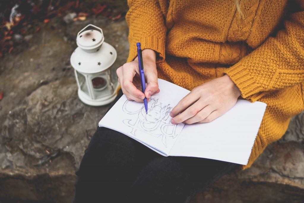
Hand-drawn elements make your website look more engaging and “human”, especially when stock images have become too common and generic. It is easy to tell that stock photos are not that authentic. Incorporating hand-drawn fonts and imagery into your design can help distinguish your brand and site. Hand-drawing is an art used by designers and graphic artists. While drawings are often used by art professionals, you can see them on top eCommerce or corporate sites.
Sketches and drawings are also useful to explain complex processes and concepts, such as how to use a product. Or you can use illustrations to get a more modern and crisp look.
Accessibility:
It is important to make your site accessible for everyone, including those who have a disability of any kind such as visual impairment. If your site is operated from the USA, you can face a penalty for not making it accessible under the ADA act. But that doesn’t mean you shouldn’t care just because you are in India or somewhere else. Keep in mind that your target audience also includes people with disabilities. You might be losing on those people if your website is not accessible for everyone.
Here are some elements you can incorporate to improve your website’s accessibility.
- Ensuring color contrast between backgrounds and text.
- Incorporating focus indicators, such as rectangular outline that appears around links when using keyboard navigation.
- Using instructions and labels.
- Using functional alt tags for images.
Simplicity:
We all have been hearing for years–simplicity is the key. But for web design trends for 2022, it is important. After all, users don’t have time to go through a complicated website with vague navigation or slow loading pages due to the cluttered graphics.
For example, the Starbucks homepage is simple yet engaging with just an image of a white chocolate mocha latte and panini. It encourages their customers to rush to their local store for getting these things.
3D Design Elements:

The past few years have seen the emergency of 3D elements for an improved aesthetic appeal. Elements such as animations, shadows or layer effects can bring depth and dimension to your web design.
Dramatic Scrolling:
While it is a common type of engagement a user does while interacting with any website, scrolling can be a great opportunity to take your visitors on imaginative journeys. You must have gone through the pages that transform into living worlds through parallax effects, and psychedelic imagery.
So these are some key web design trends for 2022 to watch out for. What do you think? Let me know by commenting below!

Started working as a digital marketing expert, Varun Sharma is now also a well-known digital marketing speaker – a speaker on performance development, and a trusted mentor to businesses in the digital world. His keynote expositions are based on the digital marketing theories, which provide a fascinating insight into the secrets of high performance.

