Customer calls to action (CTAs) can help them achieve their goals, whether they are buying products or requesting advice. In this final, crucial step of the customer journey, brands often overlook CTAs since they use standard appeals like “Click here,” “Join Now,” and “Read More.”.
In addition to increased conversions, creating illustrative CTAs also benefits search engines and users.
There are many things you can do on a website – read more, sign up for a newsletter, request a demo, provide feedback, etc. So, it’s important to have a well-detailed CTA as site visitors or readers may not always know what you are expecting of them.
How to Create a Perfect CTA?
USE ATTENTION-GRABBING WORDS
You need to make sure your audience knows exactly what to do.
A smart way to capture your audience’s attention is to make your CTA one that appeals to them to do something.
Ex –
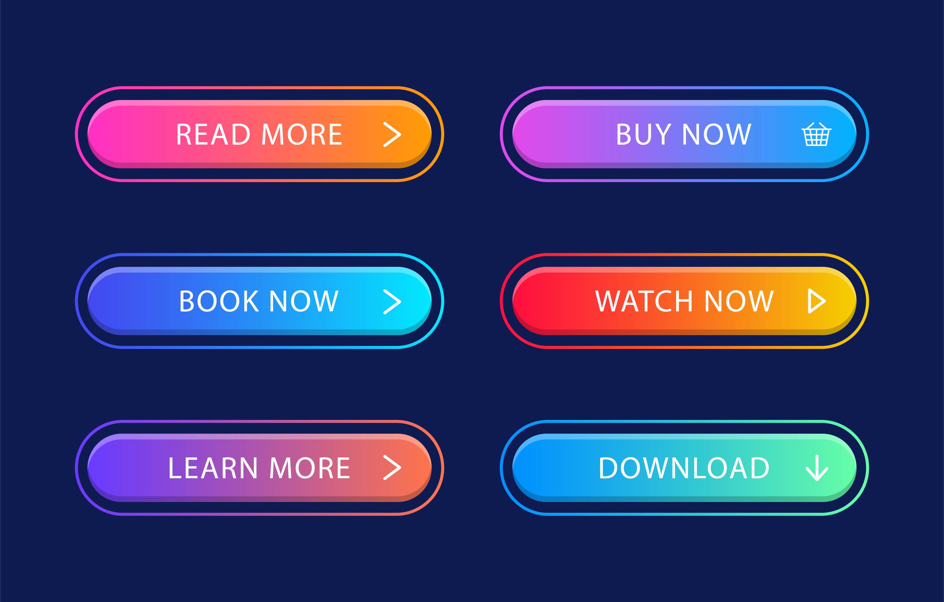
- SHOP NOW
- READ MORE
- DOWNLOAD HERE
- SHOW ME HOW
- RESERVE YOUR SEAT
Visitors are prompted to act by all these examples. Besides these, users also find other words attractive. Examples are:
- START TRIAL
- FREE
- CHOOSE
- SECRET
- DISCOUNT
- FACTS
TRY TO HELP, NOT TO SELL
A successful solution should be one that makes the customer feel like they get more than what is taken away.
A call to action is supposed to get people attached and demonstrate how your product or service can solve their problems.
When you own a cosmetic company, for example, you should point out how your products will help your customers feel more confident and why feeling confident matters so much. You can tell them how your products help them to get relief from all their skin problems.
You can pinch your Call To Action like: –
I am Ready to feel Confident
I am Ready to look my Best
You can also use a CTA for a short-term promotion or in your social media ad creative like “SHOP NOW, 50% off today only for you.”
A PERFECT PLACE FOR A PERFECT CALL TO ACTION
Despite its importance, relatively few people take this into consideration. The call-to-action button must be placed in the right place. Depending on the page’s complexity, the button should be placed differently on different pages.
According to a study, longer and simpler pages had a higher conversion rate as compared to short and a little bit complex pages. Since it contained more information in a clear manner, the longer page may have persuaded users not to quit and continue reading. However, this won’t work all the time especially if you’re targeting smartphone users since they do not enjoy scrolling.
Experts recommend placing two or more call-to-actions on a page for this reason.
For a clear picture take the help of the Gutenberg Diagram. This will give you a better view.
DISTRACTIONS CAN MAKE A BLUNDER
You will end up losing so much when you try to accomplish so much from one page, so here we would like to suggest that one landing page is ideal for or dedicated to one single goal.
Avoid using so many headings, so many Calls to action, ads, and unnecessary pop-up.
STATISTICS ARE MORE POWERFUL
Click-through rates are typically higher when you include a compelling statistic. In some industries, the concrete facts seem to resonate more than a clever copy. The fact that a lot of people have already downloaded, purchased, or registered for the offer, product, event, etc. Provides a sense of urgency to your visitors. It is a surefire way to be sure they won’t miss out. Numerical evidence can be an invaluable tool for your company – just be honest, or you can lose its credibility.
CONTRAST MAY WORK
Colors that stand out from your website’s other elements will make your Call To Action jump out. It was found that high contrast, rather than particular colors, increased conversion rates. It is imperative that the site visitor never wonders what to do next, so buttons that stand out work best.
SMALL IS NOT ENOUGH
Call To Actions may be ignored if they are too small. Don’t make your button so big that it drowns out other relevant information on the page. Make your button prominent enough to draw attention without overwhelming the rest of the page.

An enthusiastic Human Being with a zeal to express as much she can in words… and Blogs gave her a medium to express and share her knowledge. Has written for eminent blogs and fields like the social media, internet marketing, technology, lifestyle (tattoos, body art, fashion, etc.), politics, and the list is still increasing.


